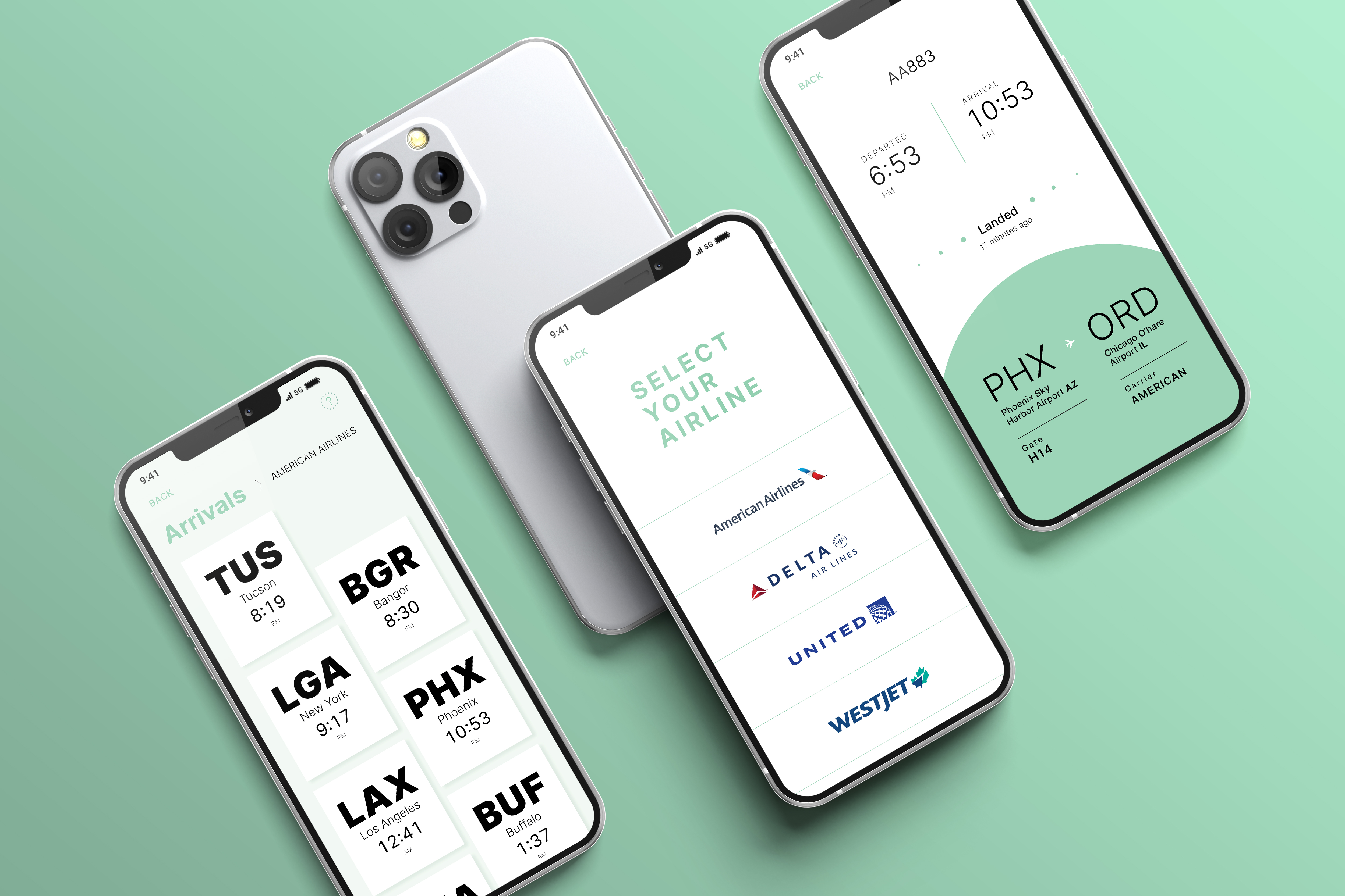
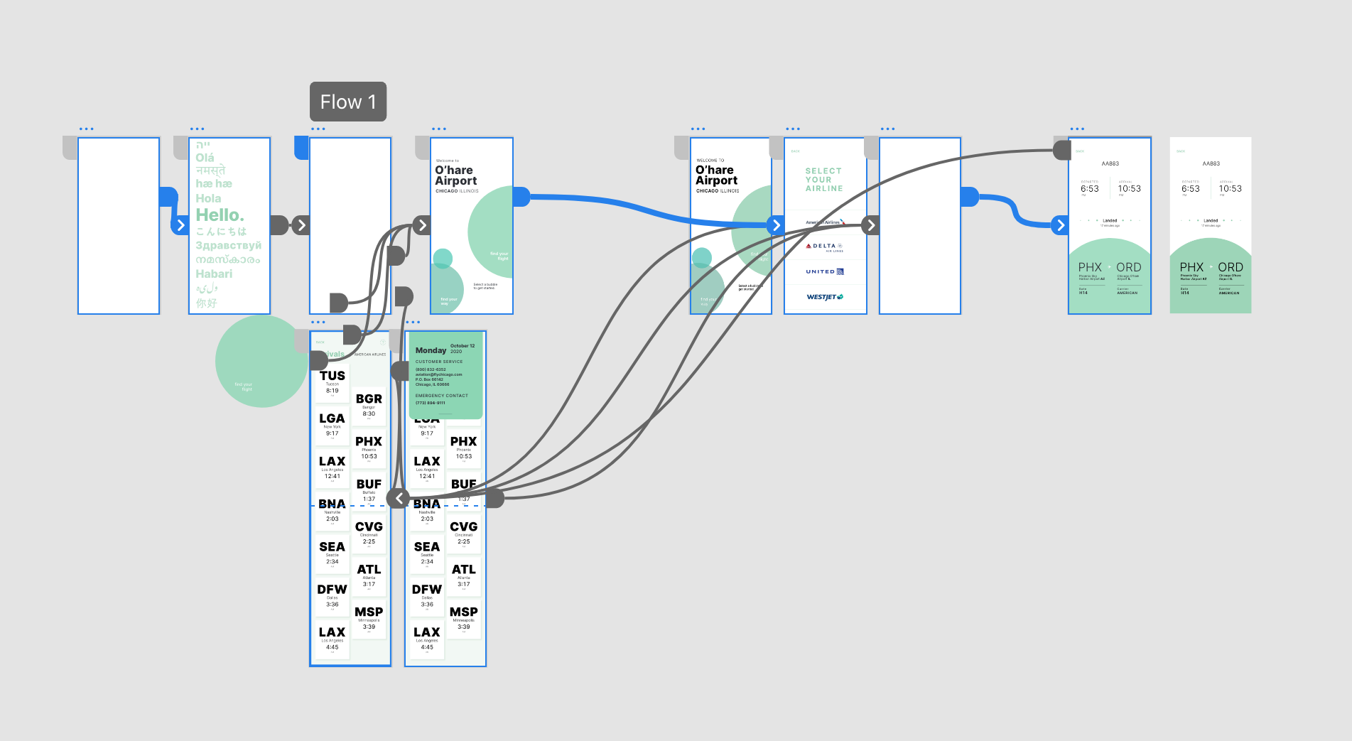
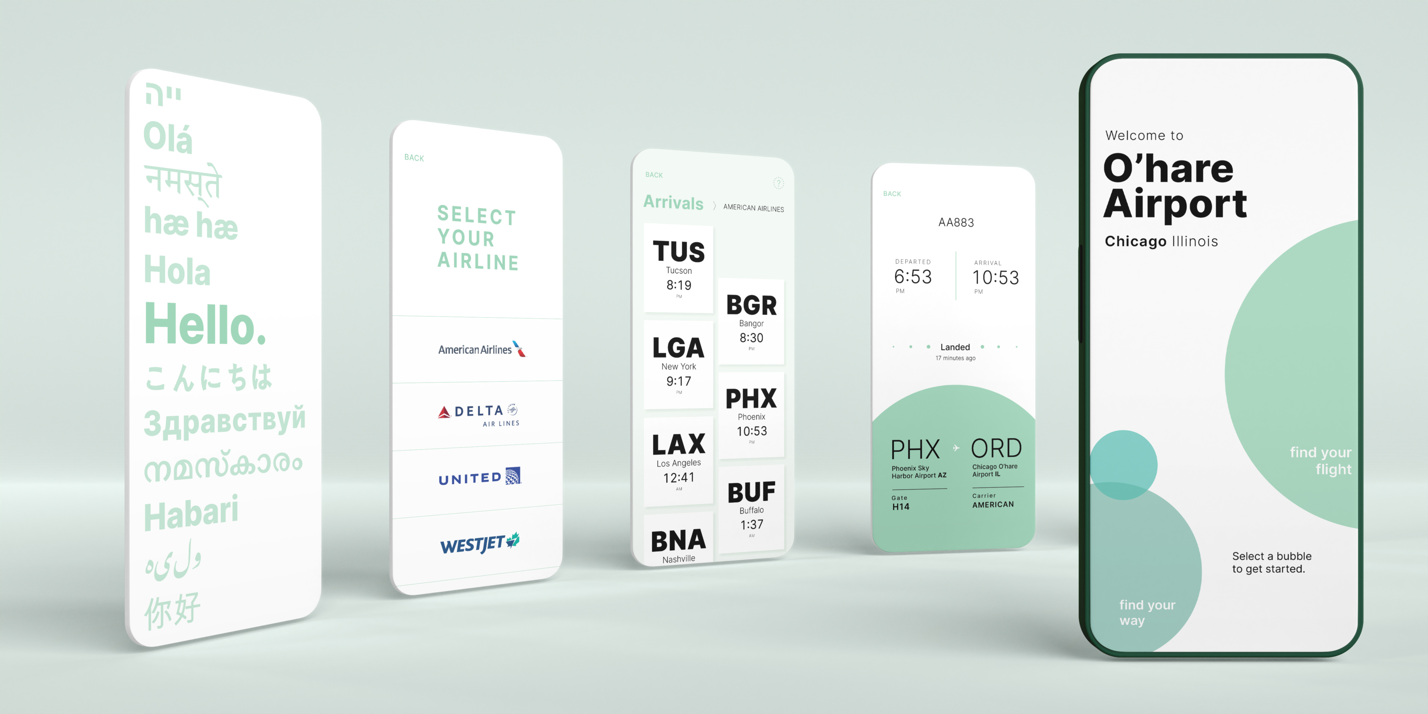
OBJECTIVE
Create a mobile site to check a flight’s information and status at Chicago’s O’Hare International Airport. Make vital and often stressful airport information easily digestible for the user. Apply typographical principles in a practical manner to ultimately create a streamlined and relaxed travel or pickup experience.
ACCESSIBILITY IS DESIGNING WITH EMPATHY
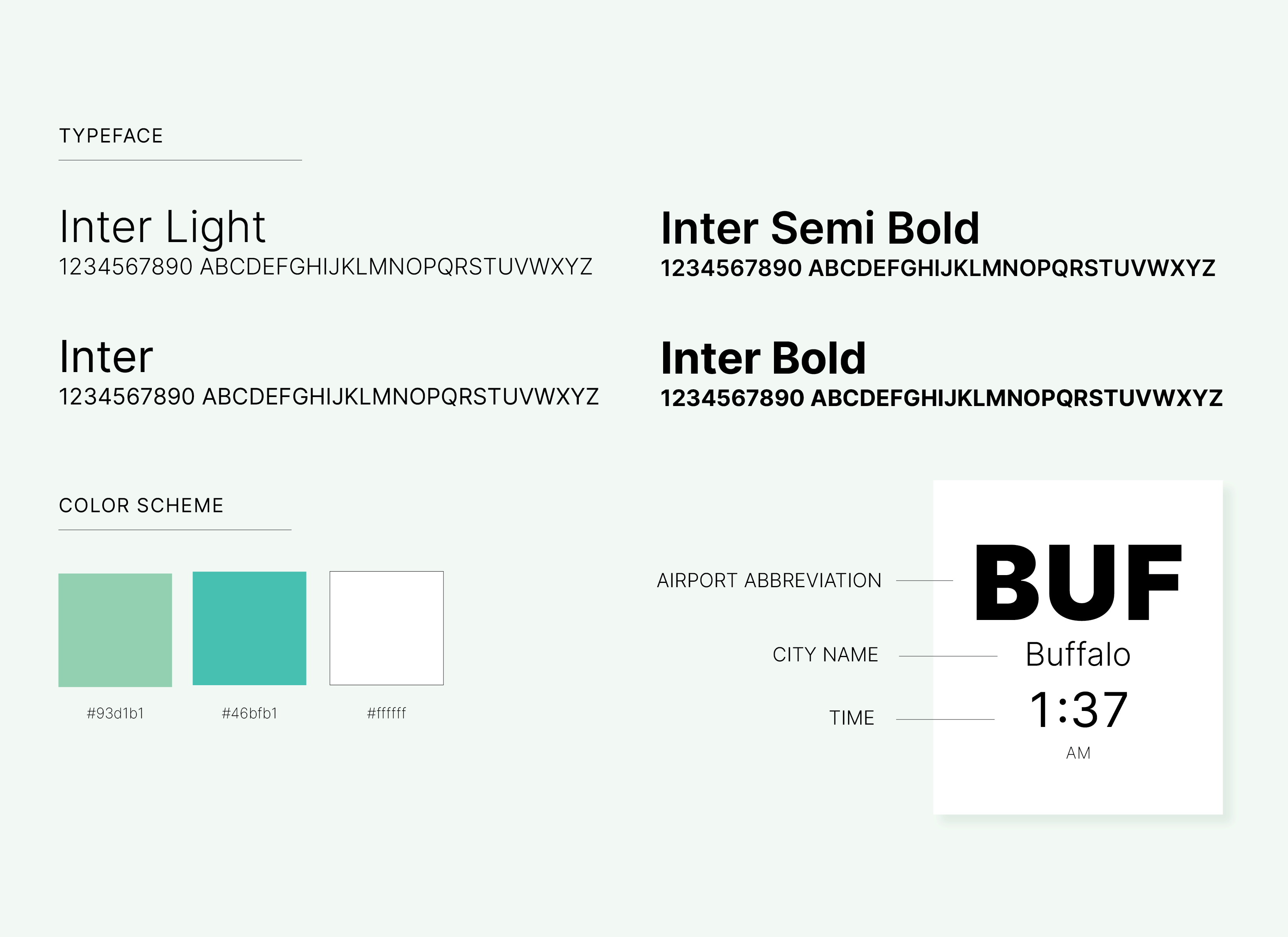
I actually designed my screen iterations wearing glasses that simulated various visual impairments, allowing me to pick a typeface and type size that were easily legible to all users even in a fast paced environment. I also had discussions with users who had color blindess, cataracts, glaucoma, severe myopia, floaters, etc.
Open counterspaces, tall x-height, and varying weights: I look for qualities like these in a typeface to optimize legibility.
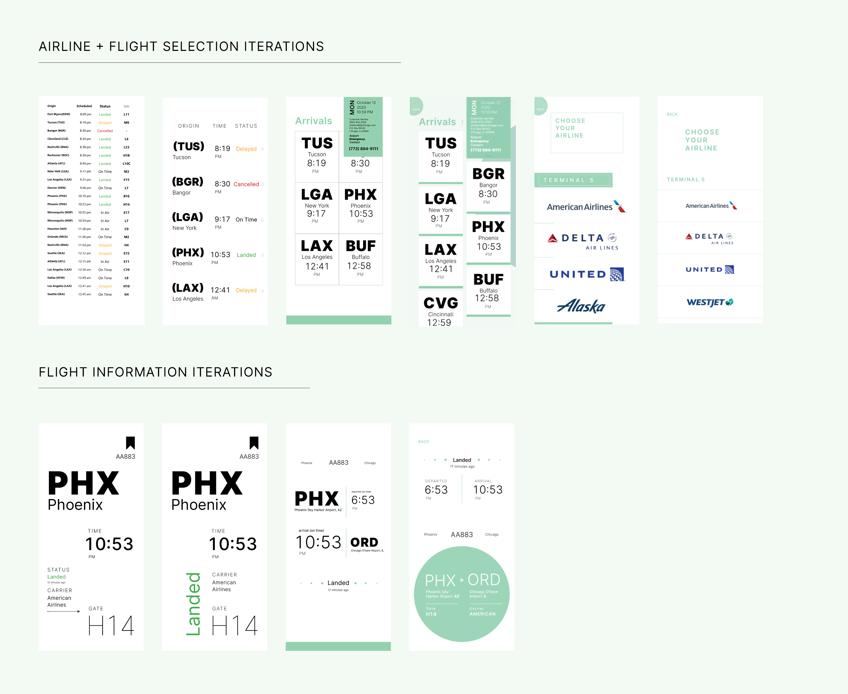
WHAT IS MISSING?
Feedback from people who regularly interact with the space involved a desire for knowing not only the status of a flight, but also exactly how long ago an aircraft landed to help users better estimate pick up times.
MAKING DIVERSITY A DEFAULT
As someone who grew up in different countries, I had to switch between different languages most of my life. Needless to say, language is incredibly important to me. Since O’Hare is a high traffic International airport, it sees a variety of diverse users each day. I wanted the mobile site to cater to various language speakers without the clichéd use of flag icons or a drop down menu. Ultimately, I landed on a typographic language selector which doubles as a welcome screen.