BACKROOM: A POLITICAL SATIRE PUBLICATION
OBJECTIVE
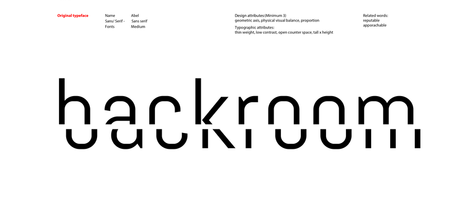
Develop a publication brand identity and a wordmark that appropriately communicates the publication’s purpose. My publication, Backroom, is an informative yet comedic political satire publication that covers current events from across the globe.MADLIB WRITING
By characterizing this political satire publication’s identity through language, I was able to ideate on potential wordmark design decisions that reflected the qualities of what I wanted Backroom to be.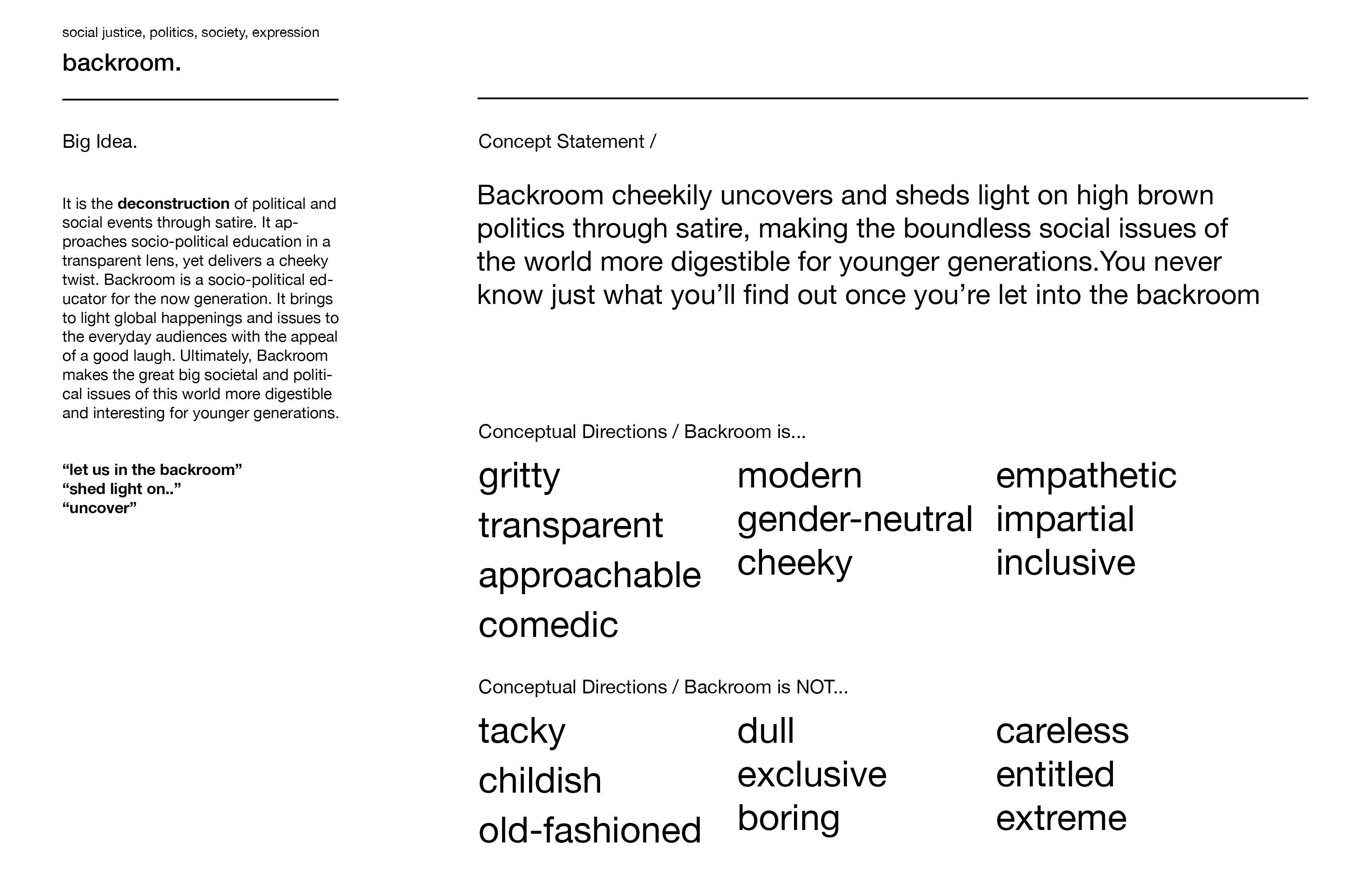
SKETCHING
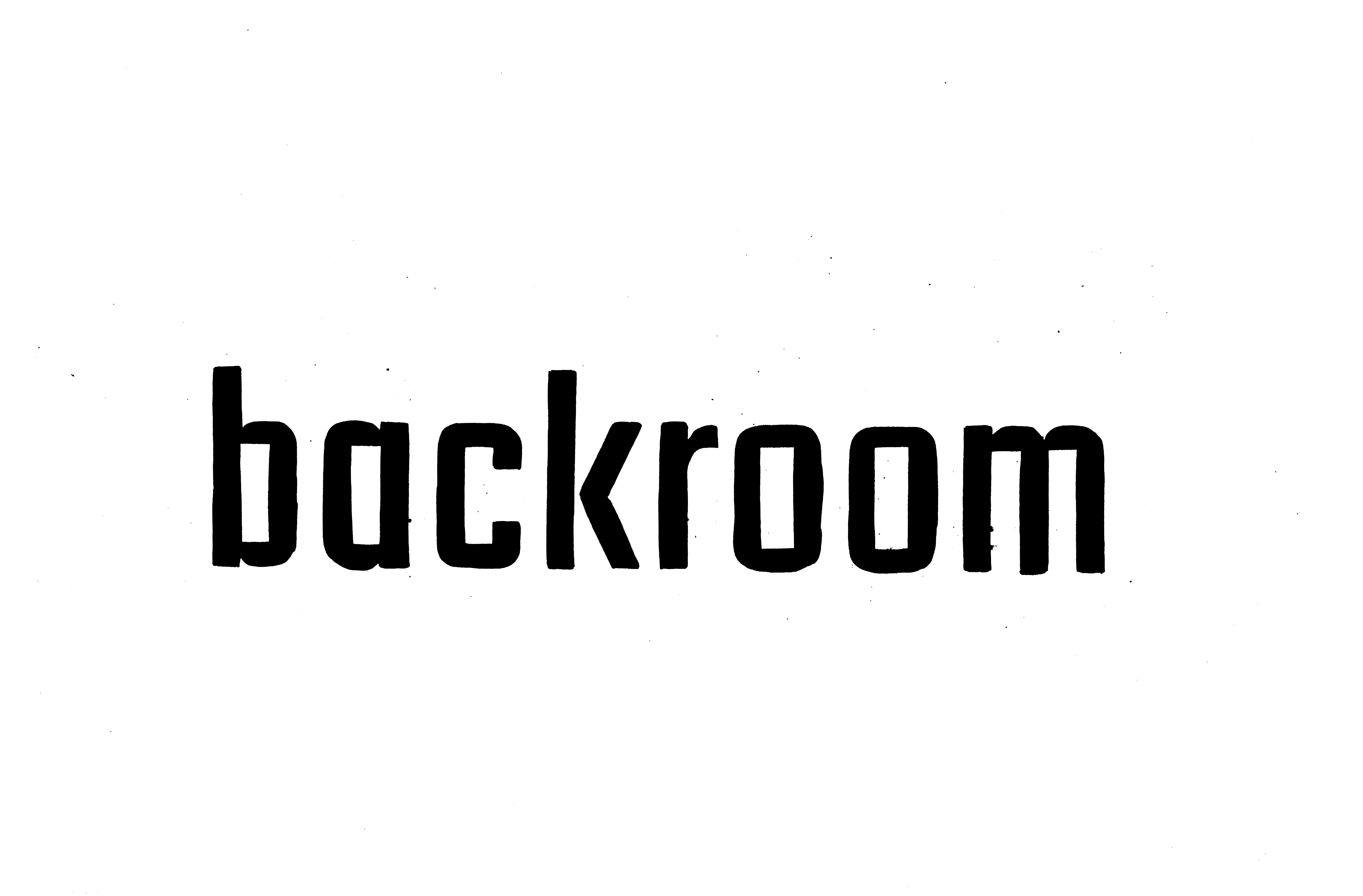


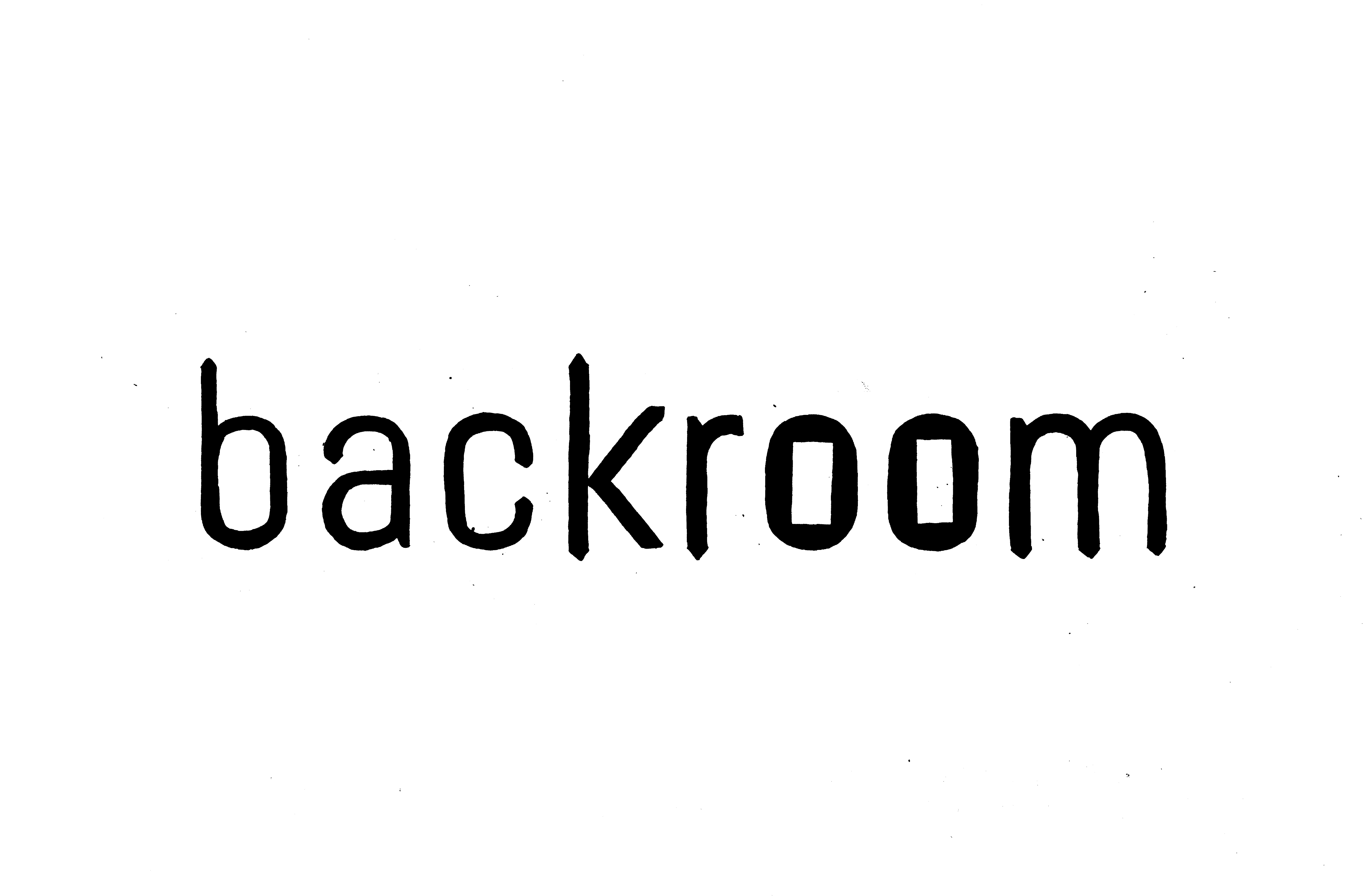
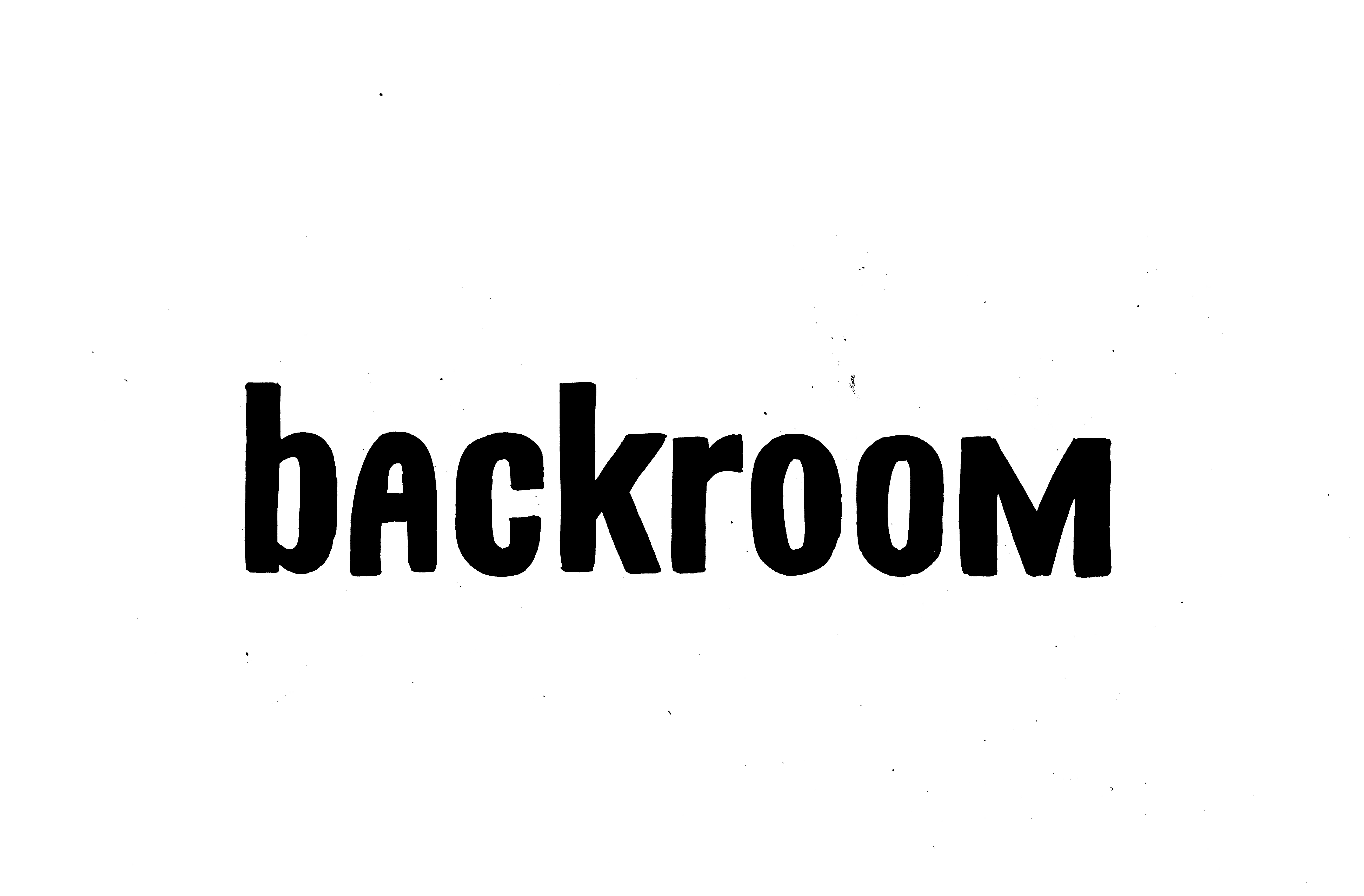
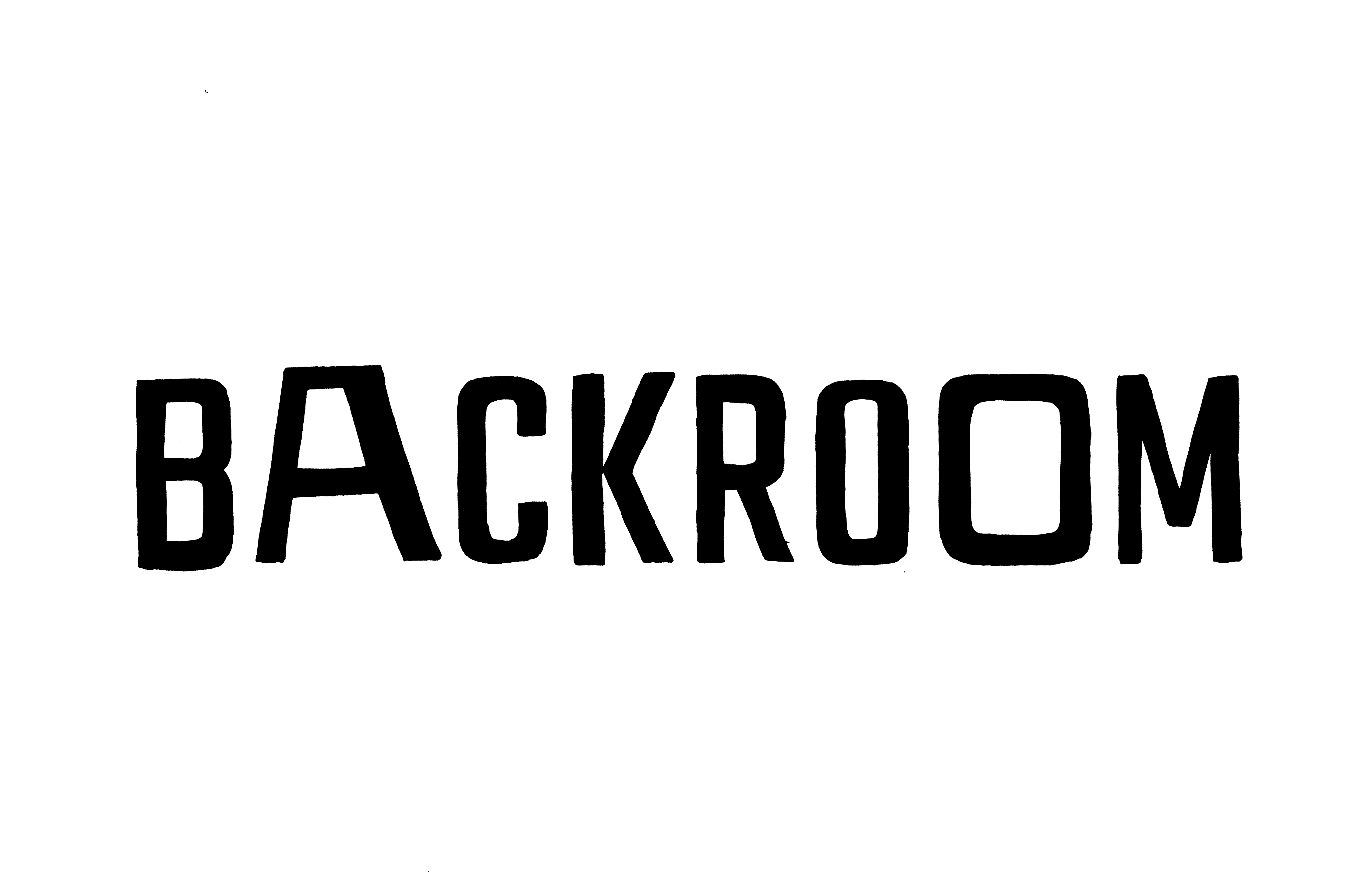
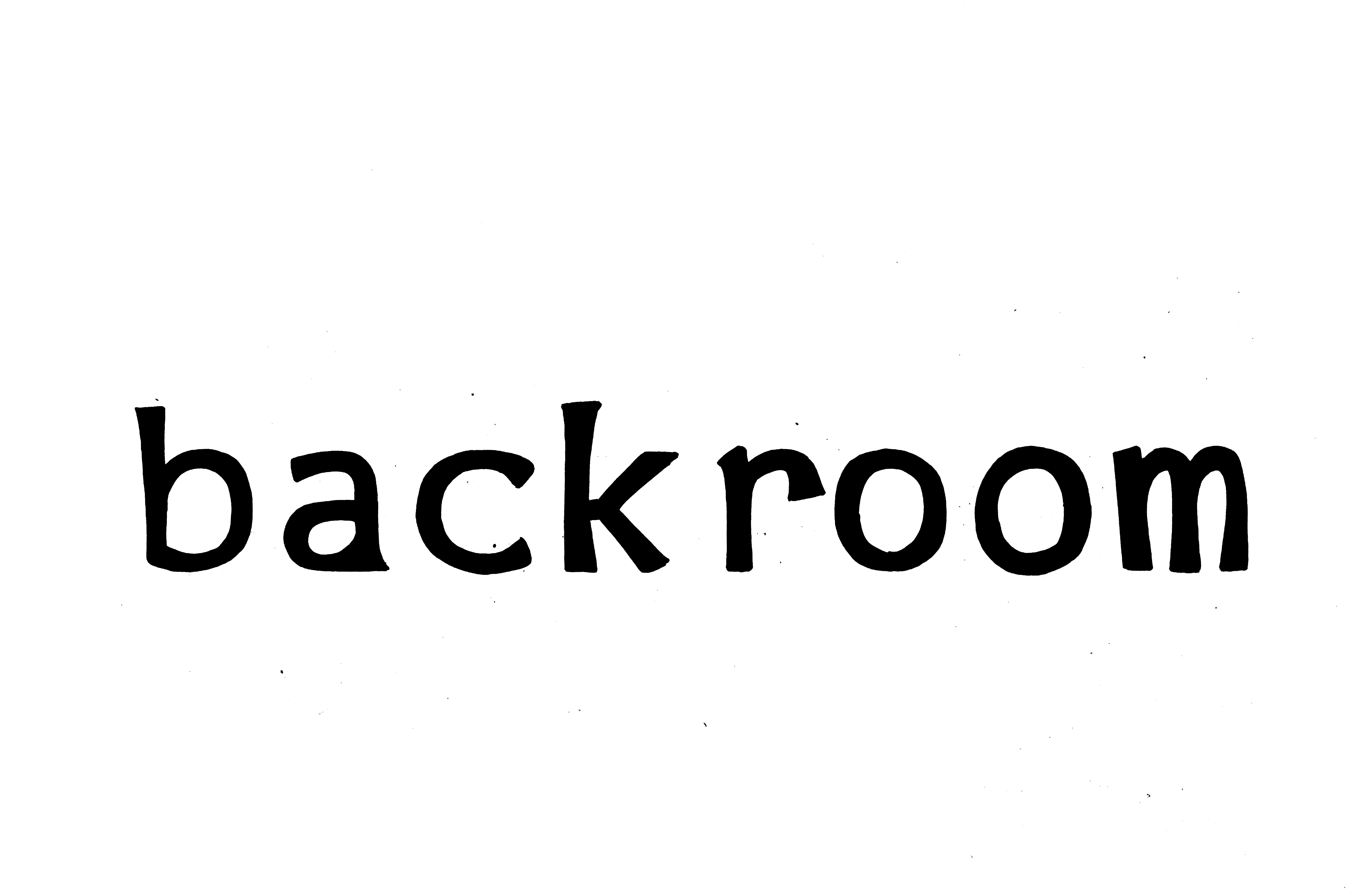
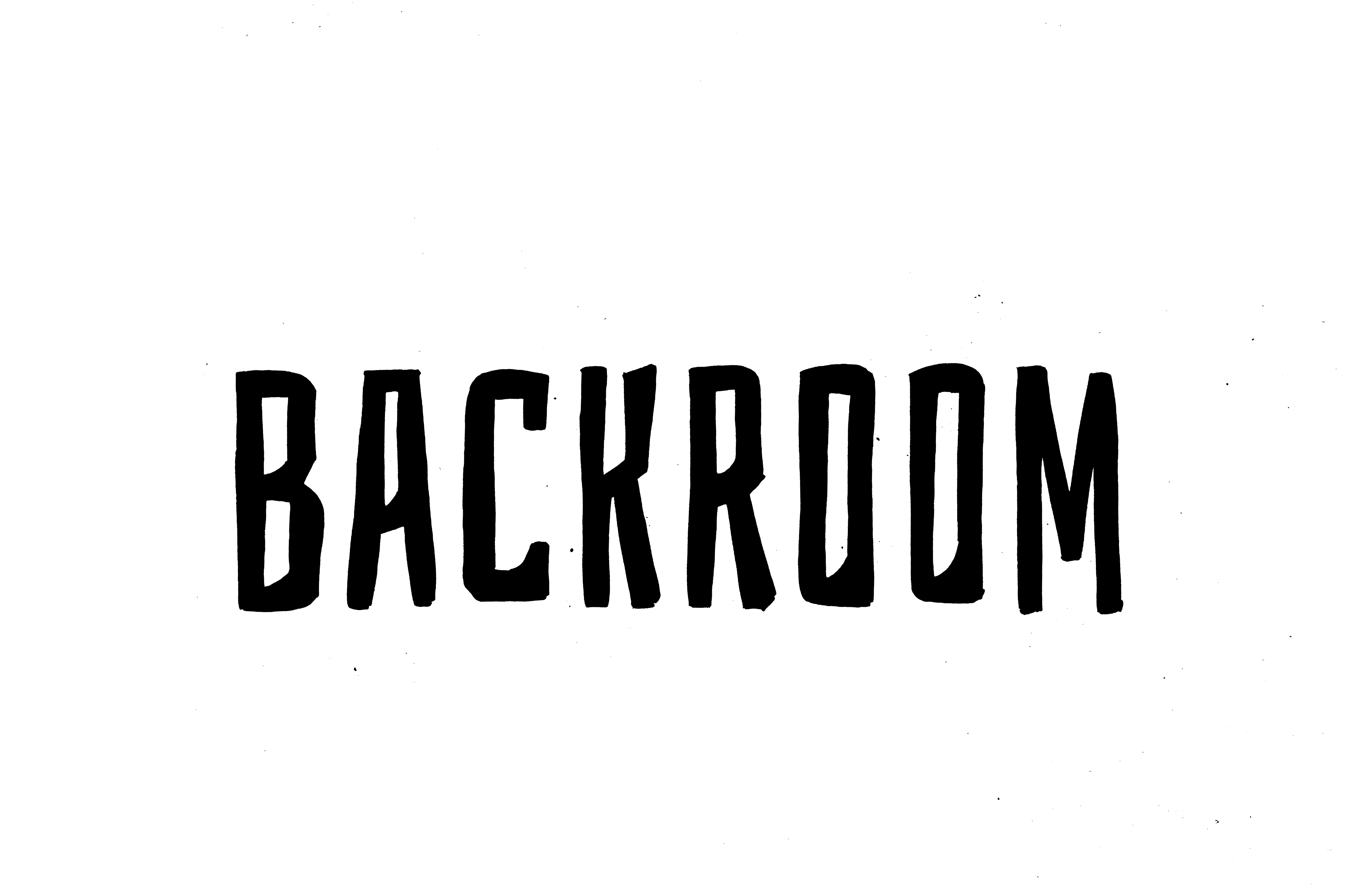

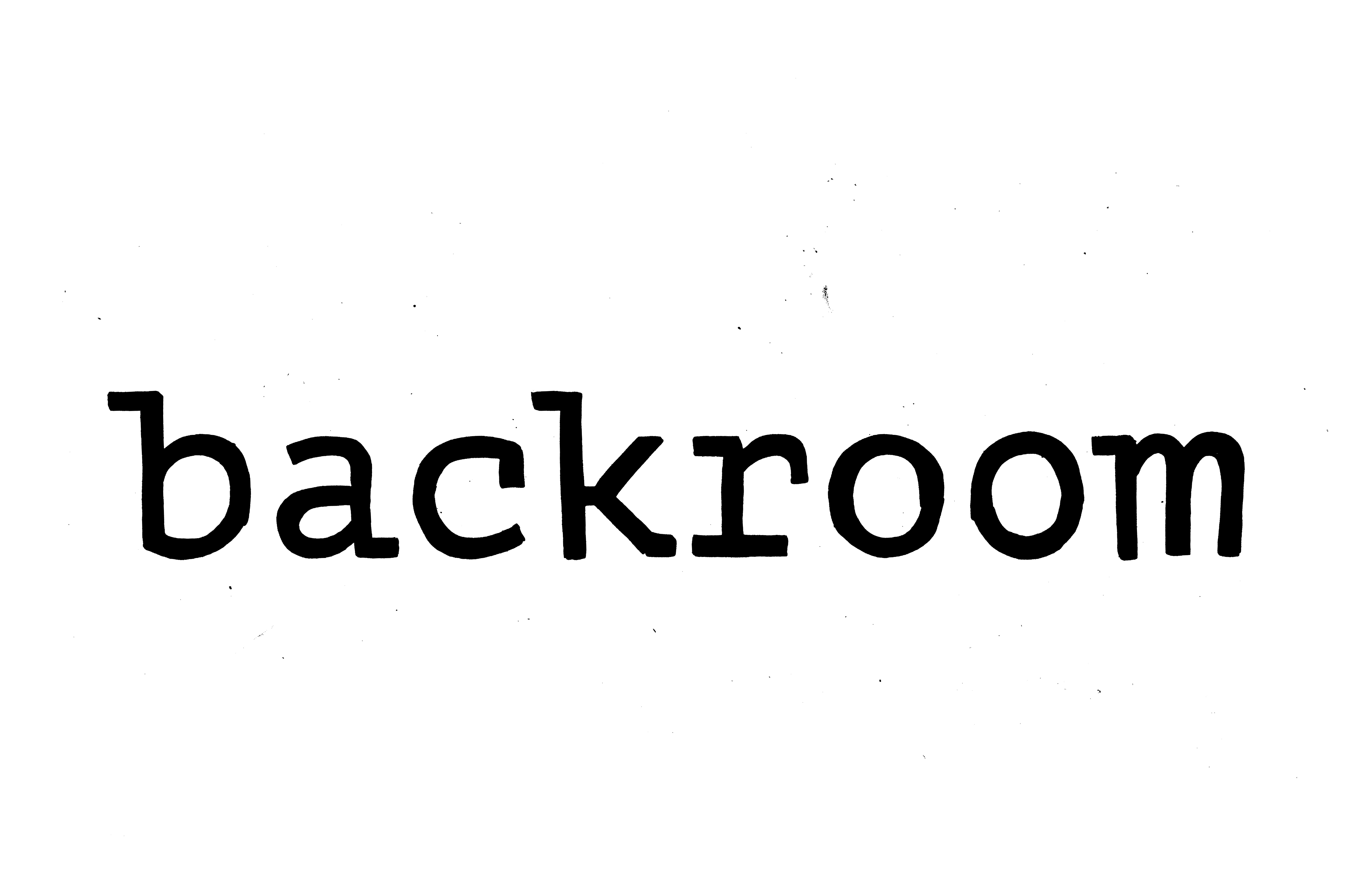


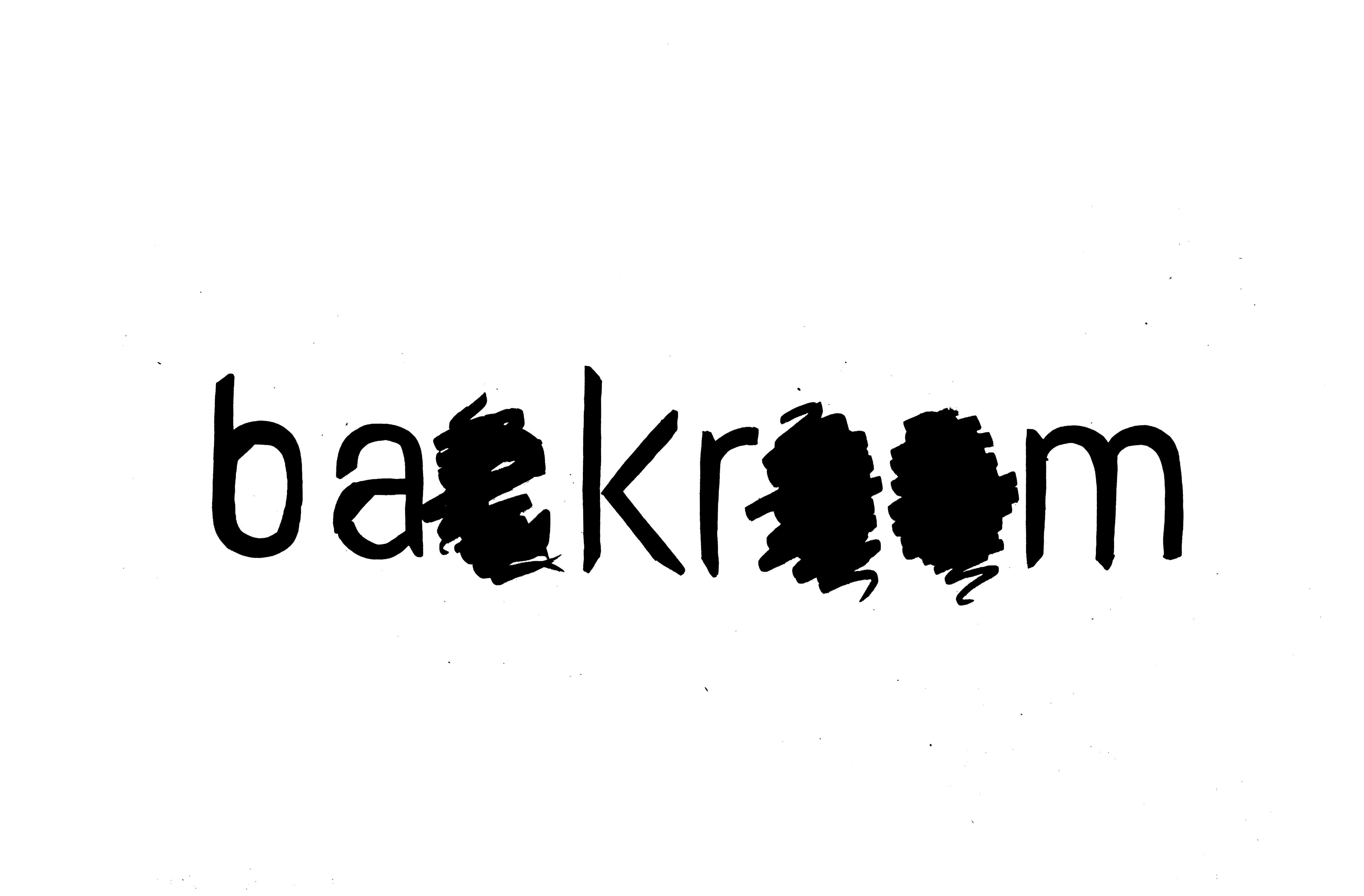

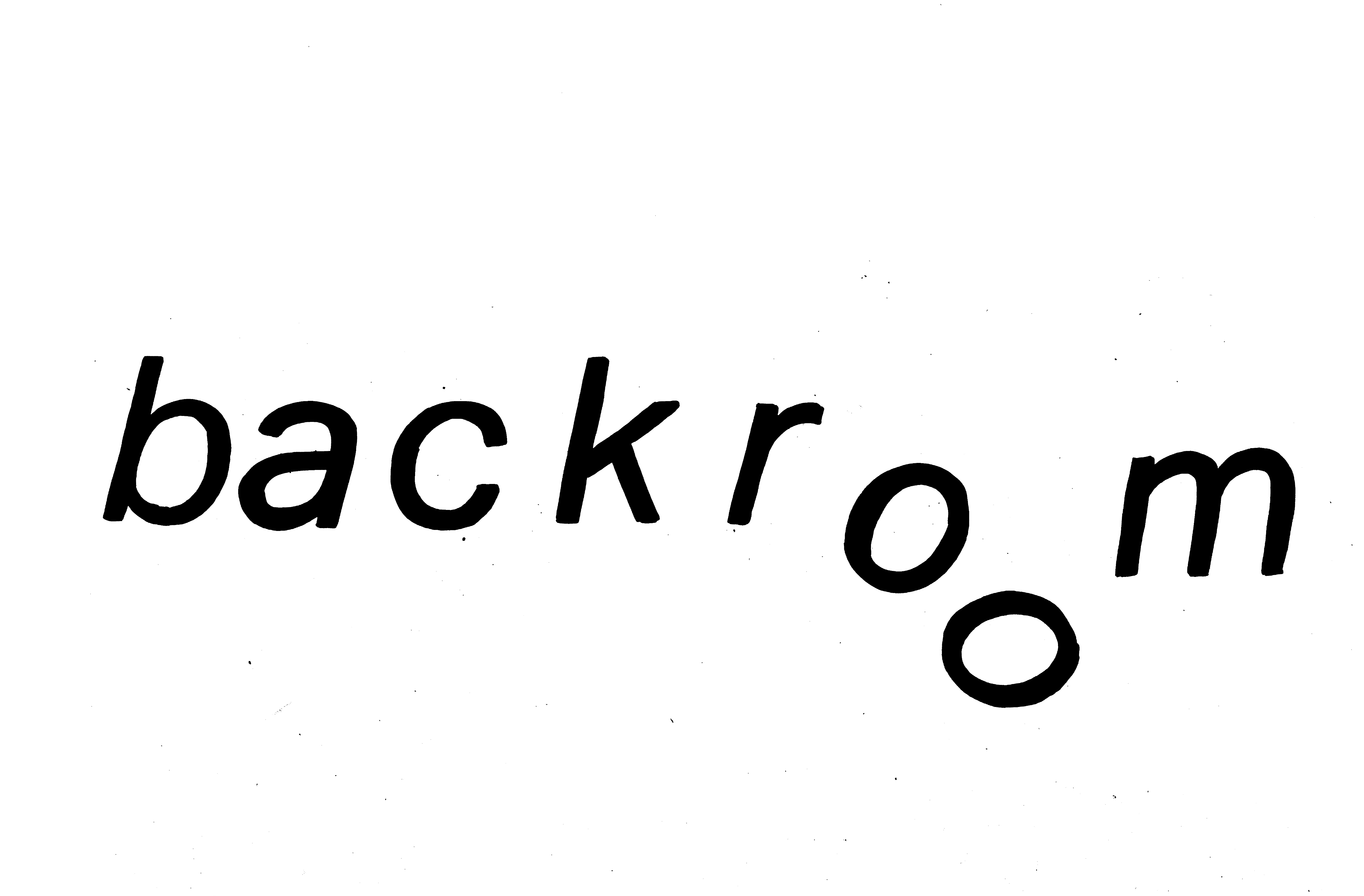

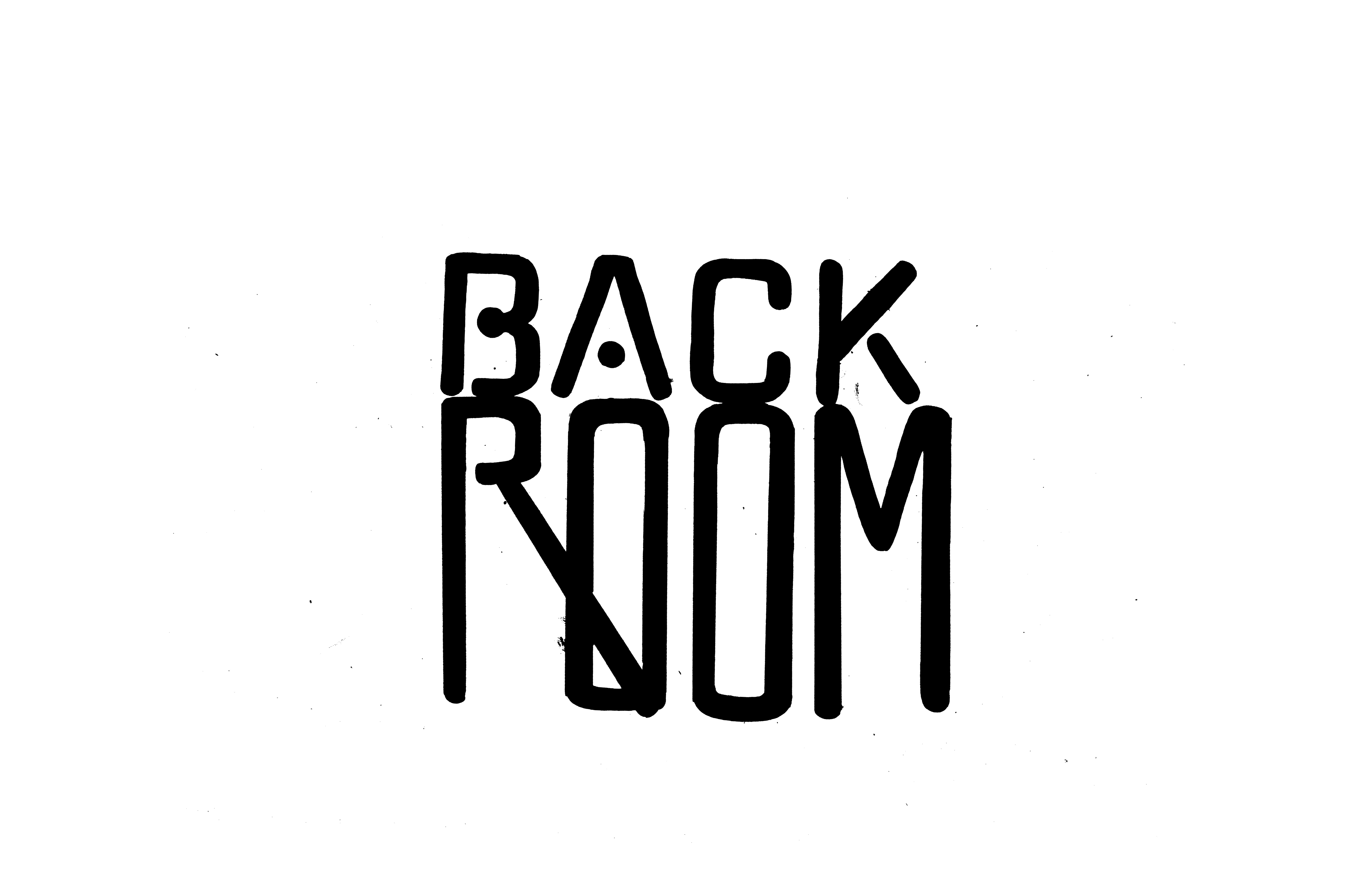
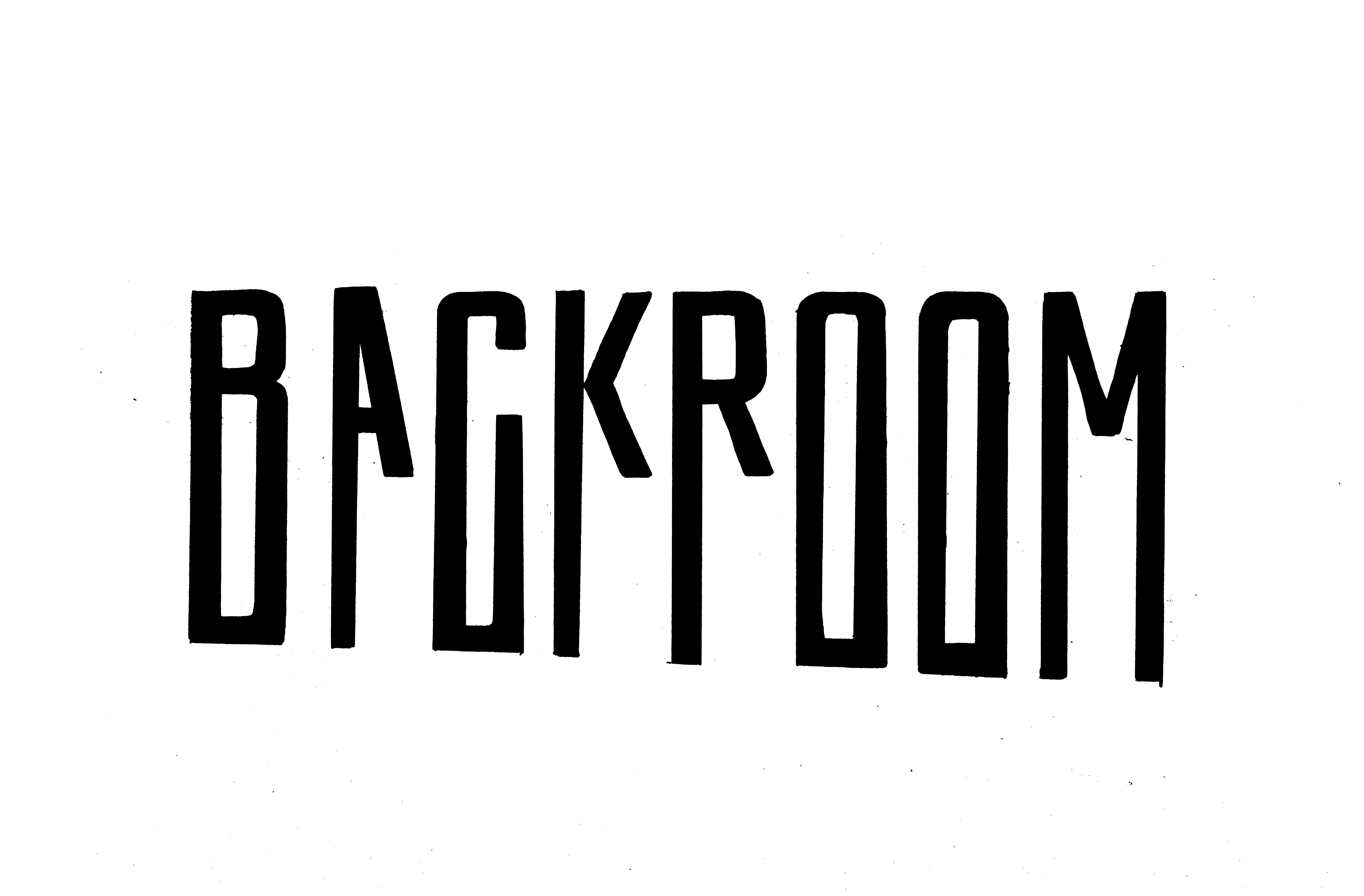
LEADING CONCEPTS
Deconstructing political science

Uncover the truth

Comedic: off the baseline;
across the page
across the page

Shed light on high-brow politics

Subvert in a subtle way

Hyperbole; stretch the truth
HOW DOES A PUBLICATION STAY CONSISTENT?
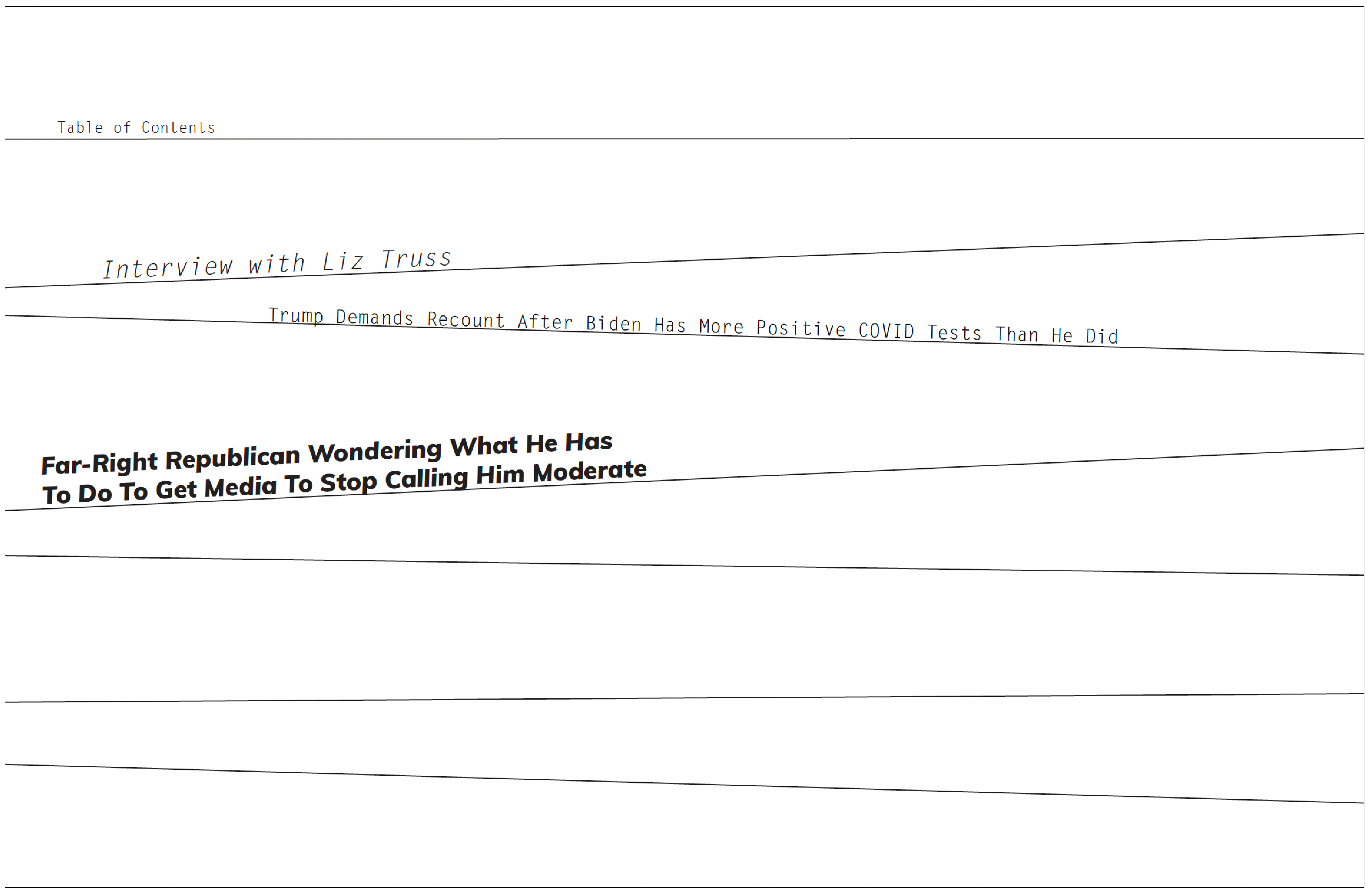
It’s important for publications to have structural systems in place so that different designers can work on various issues while maintaining the cohesiveness of the publication’s identity. (This is especially the case in a crazy satire publication like Backroom because of the experimental and rambunctious methods of communicating the satirical content!) Backroom’s dimensions are small and compact on purpose—I wanted the physical copy to feel sleek and almost secretive, like you’re sneaking shocking information out of the backroom!

PHYSICAL EXPERIMENTATION
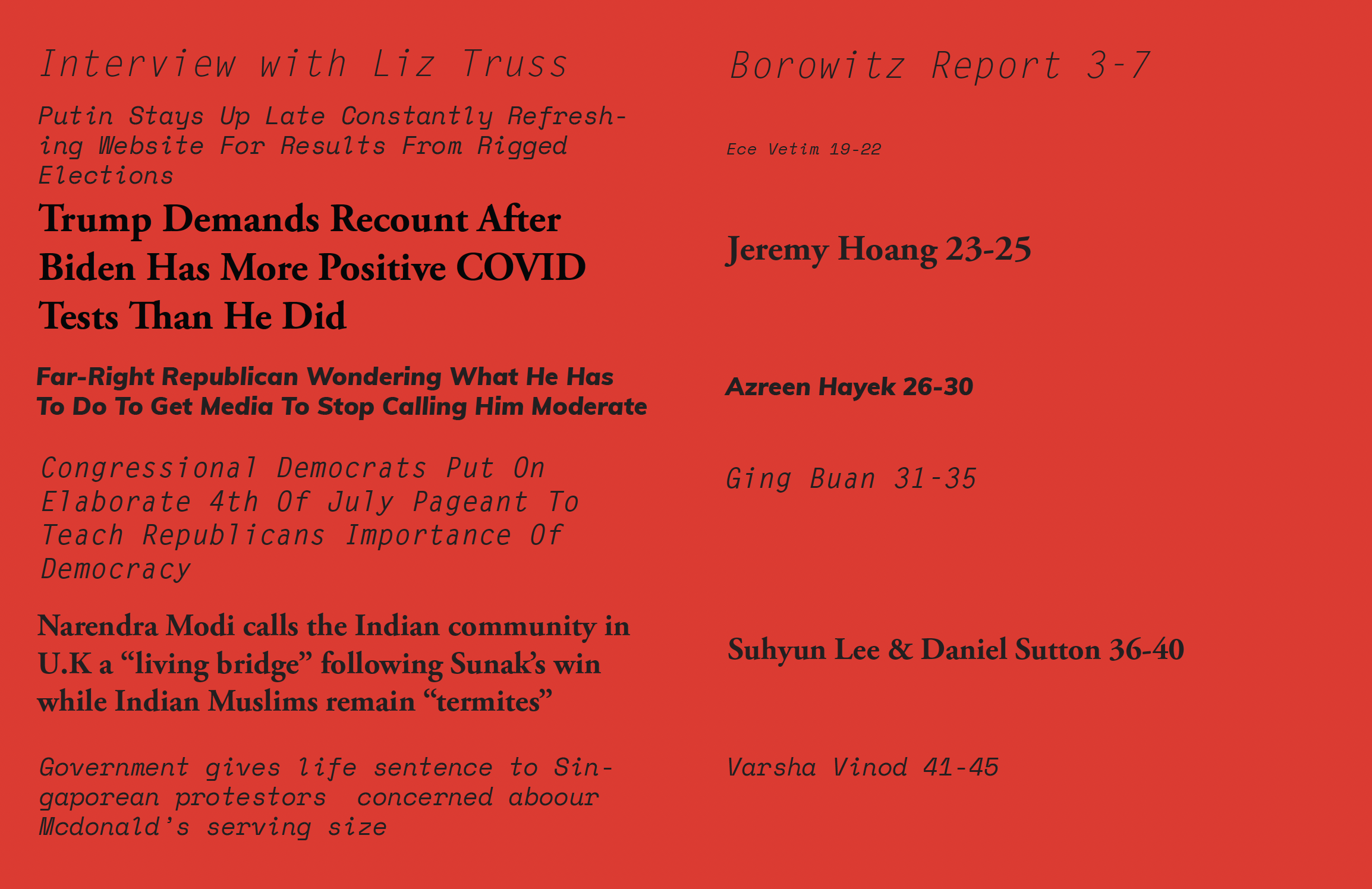
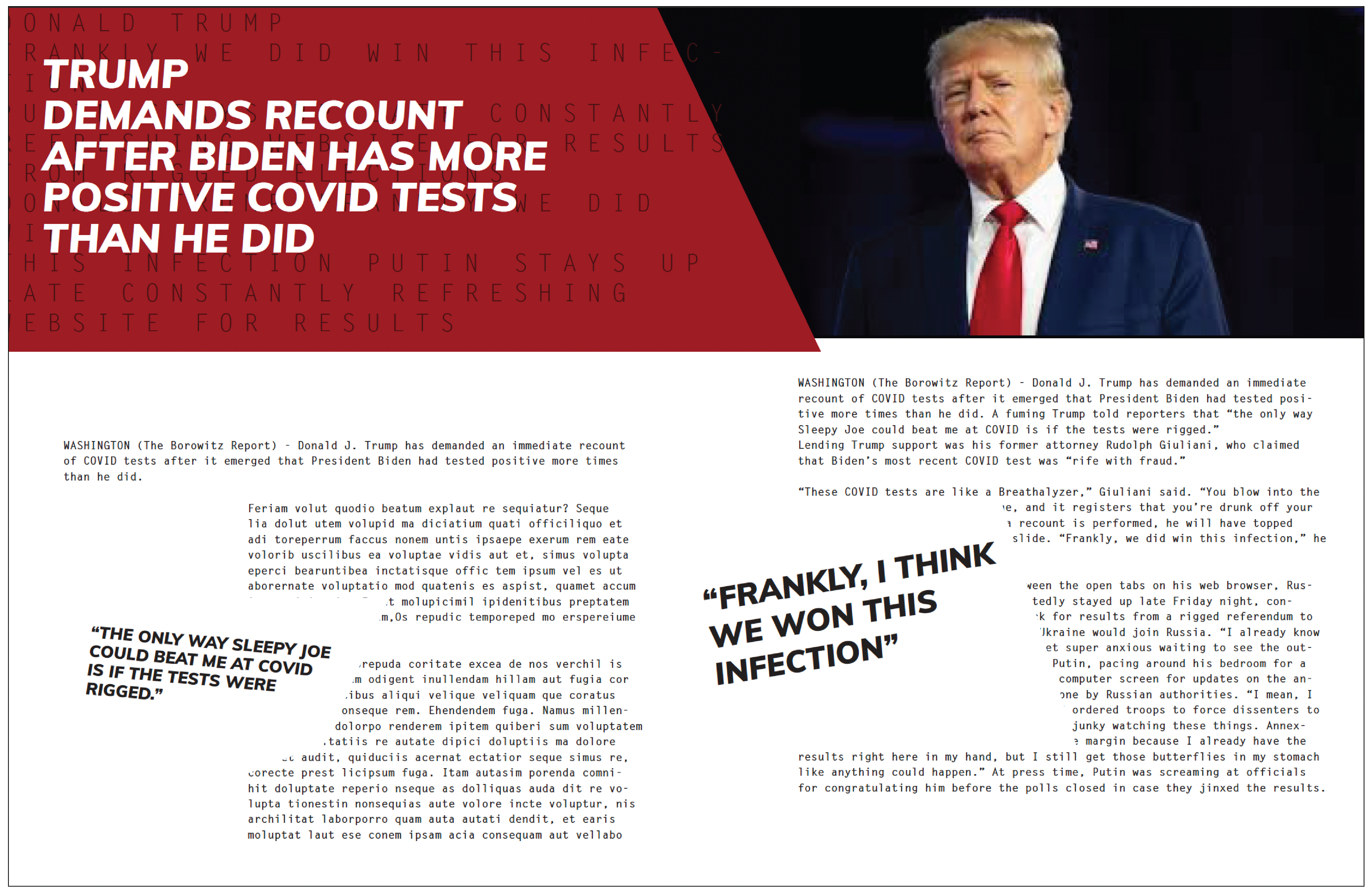
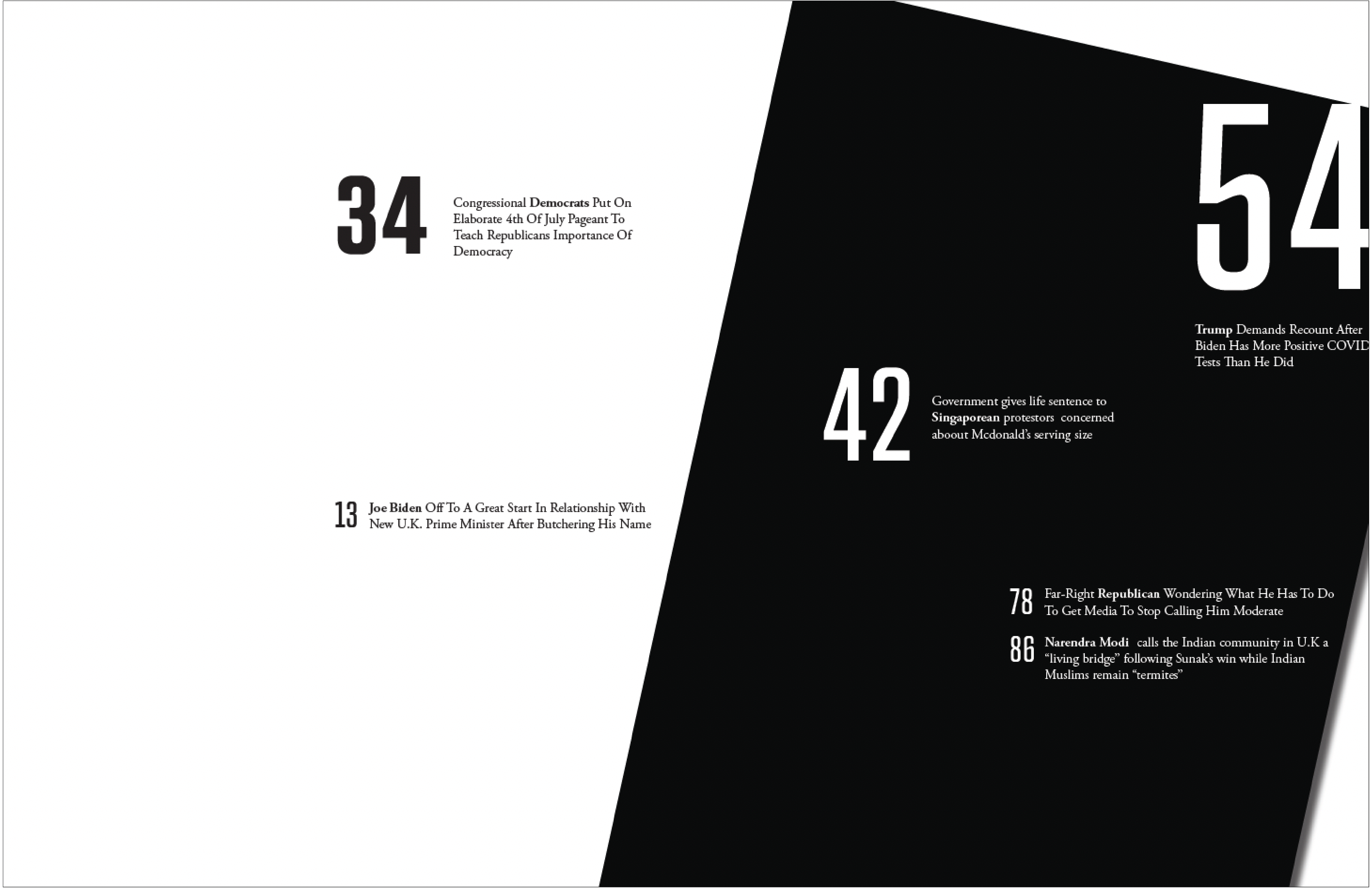
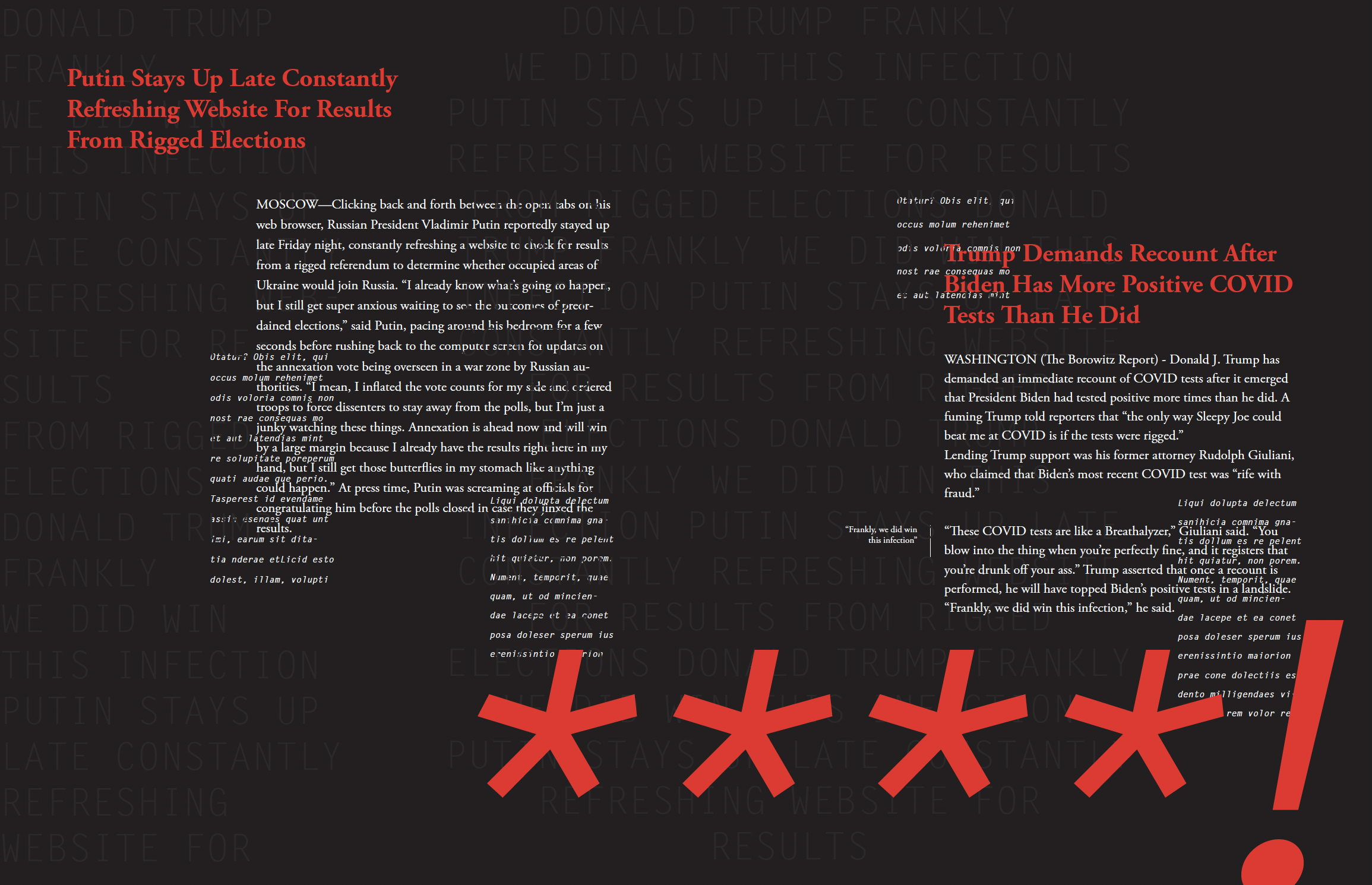
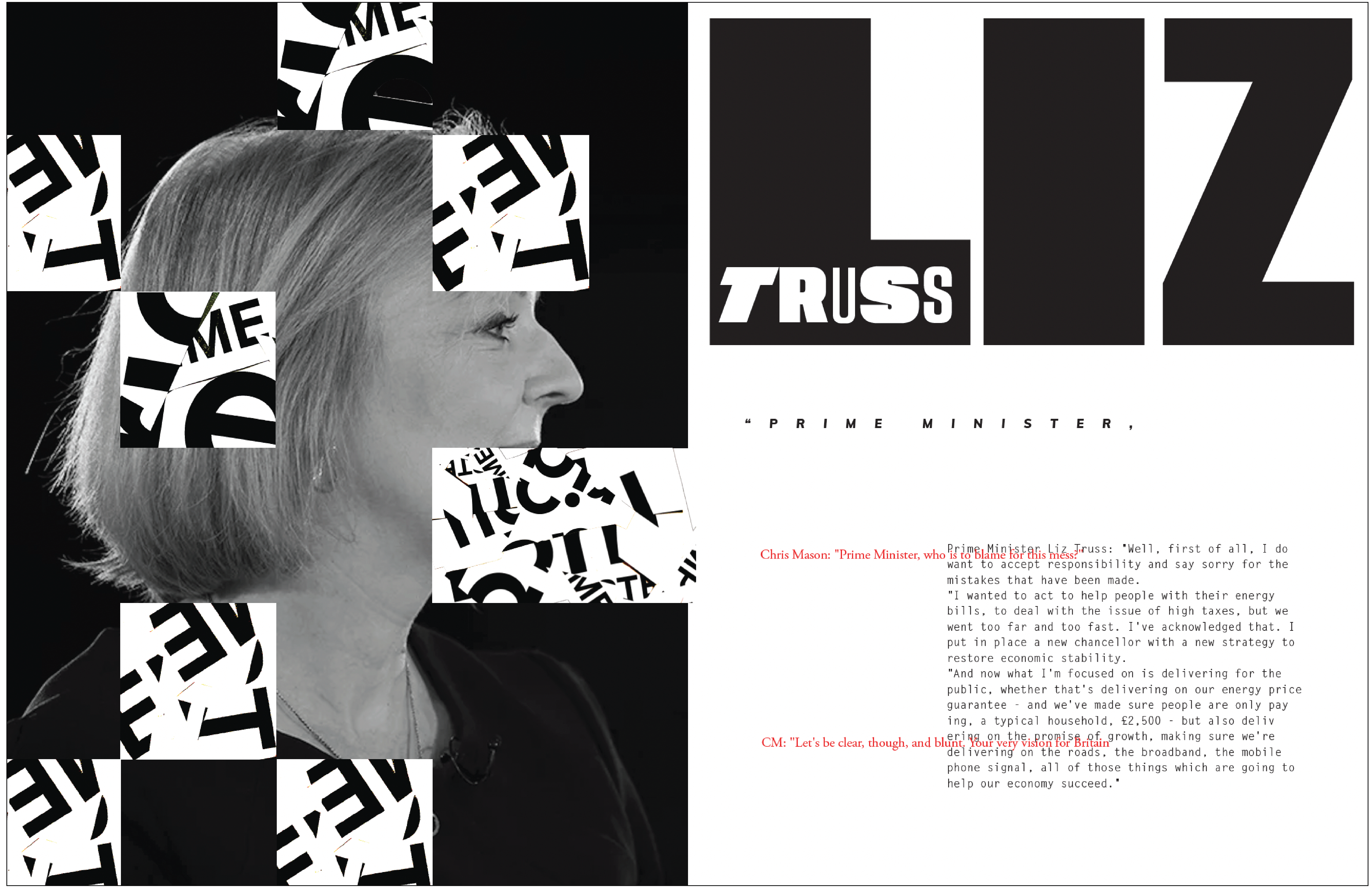
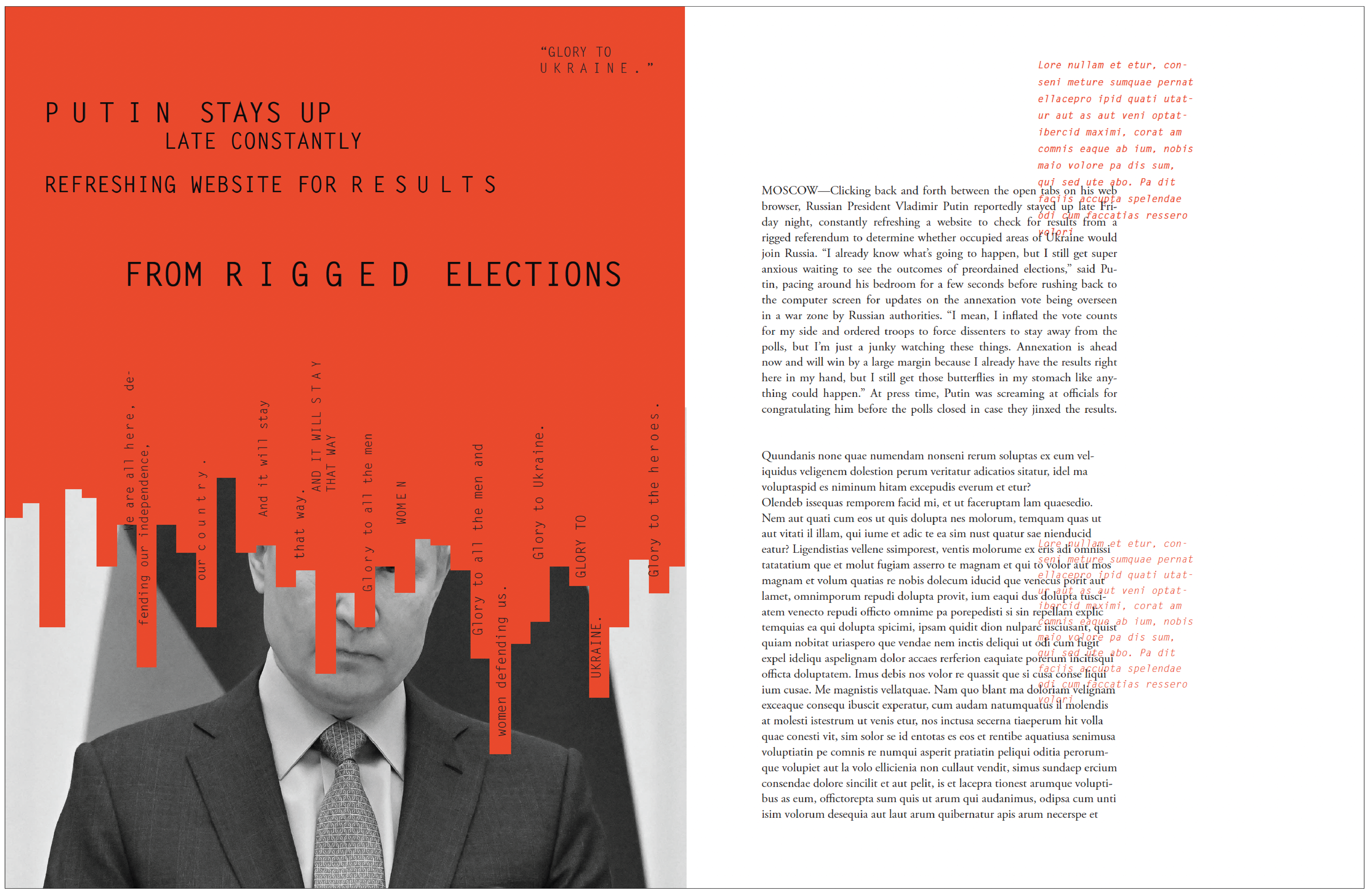
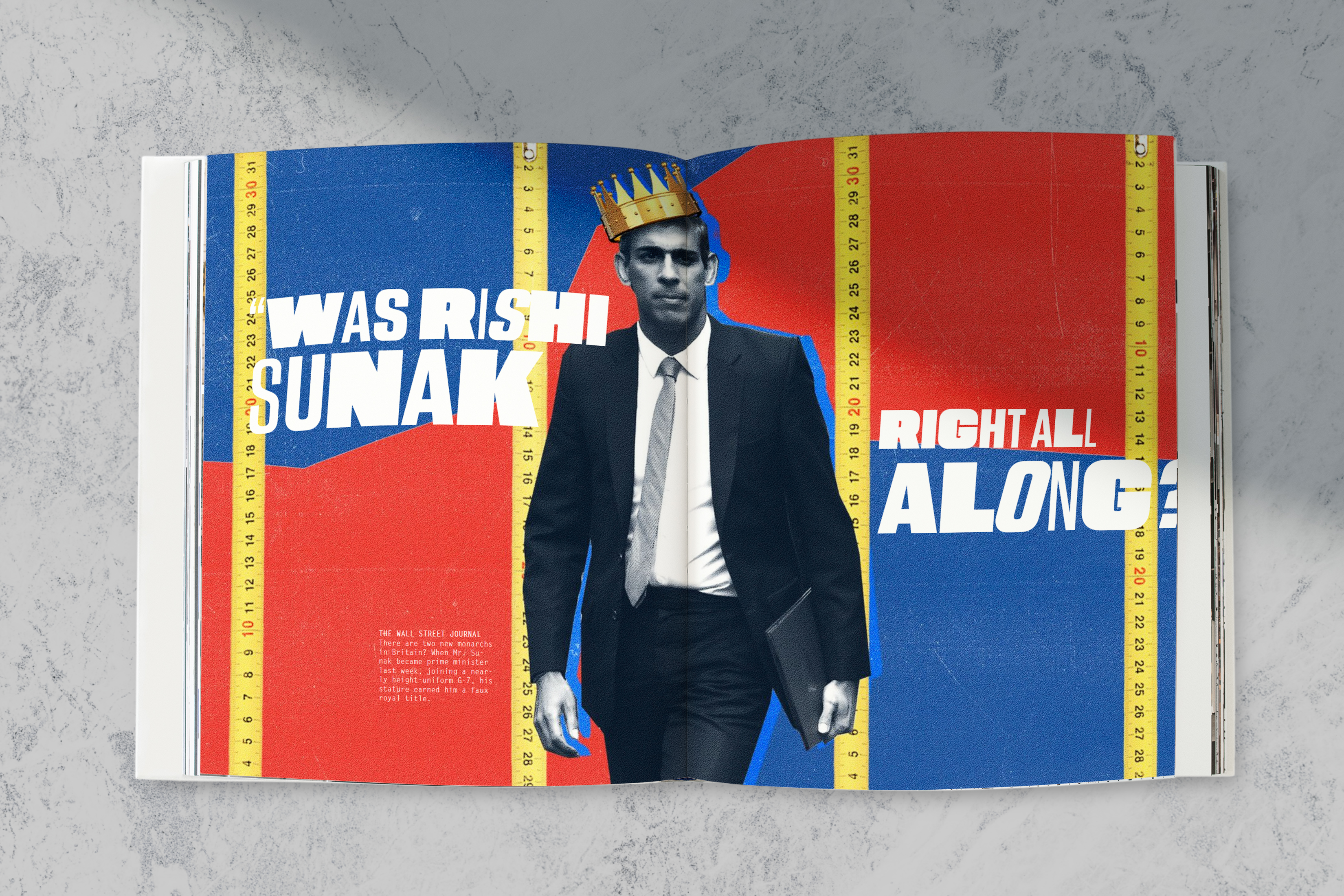
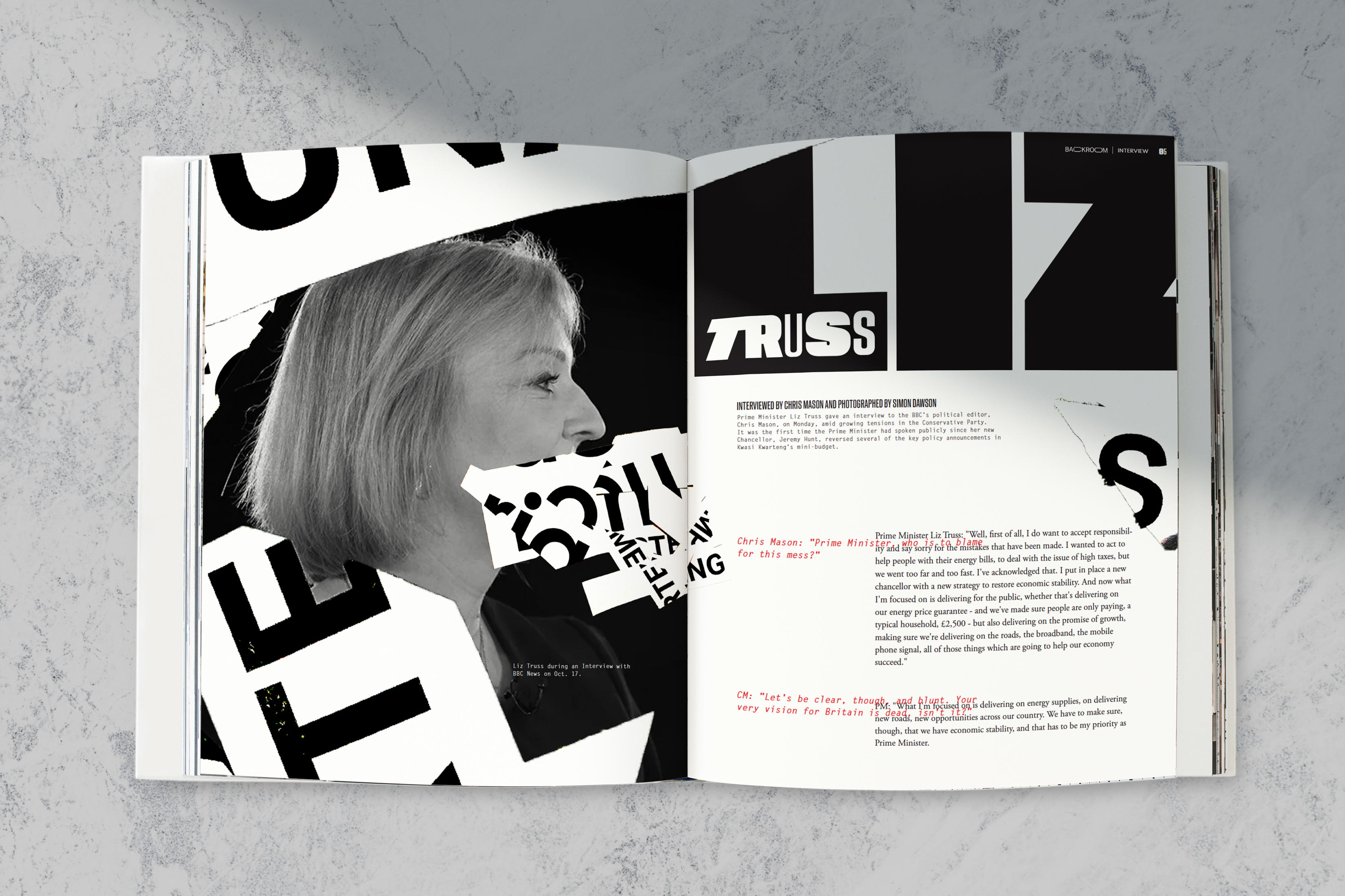
Backroom is not formal or rigid, so why should its design be? Embracing the exaggerated nature of political satire and the hyperbolic Backroom wordmark, I experimented in waggish ways. Some spreads called for physical layering and manipulation, while some called for some photoshop fun. Through all this experimentation however, I wanted my visuals to communicate the facts, while diverting expectations.DIGITAL EXPERIMENTATION
I wanted to go far past the limits of what I know design to be through color and typography experimentation and image alteration. But I’ve found that even when my design method for Backroom entailed “going crazy”, I need to create some structure to avoid getting lost in my own process. I worked in short sprint sessions, allocating a small goal per session. For example, “in the next 30 minute block, I will design a cover concept using typography inversion”





(ADDITIONAL CONCEPT EXPLORATIONS)




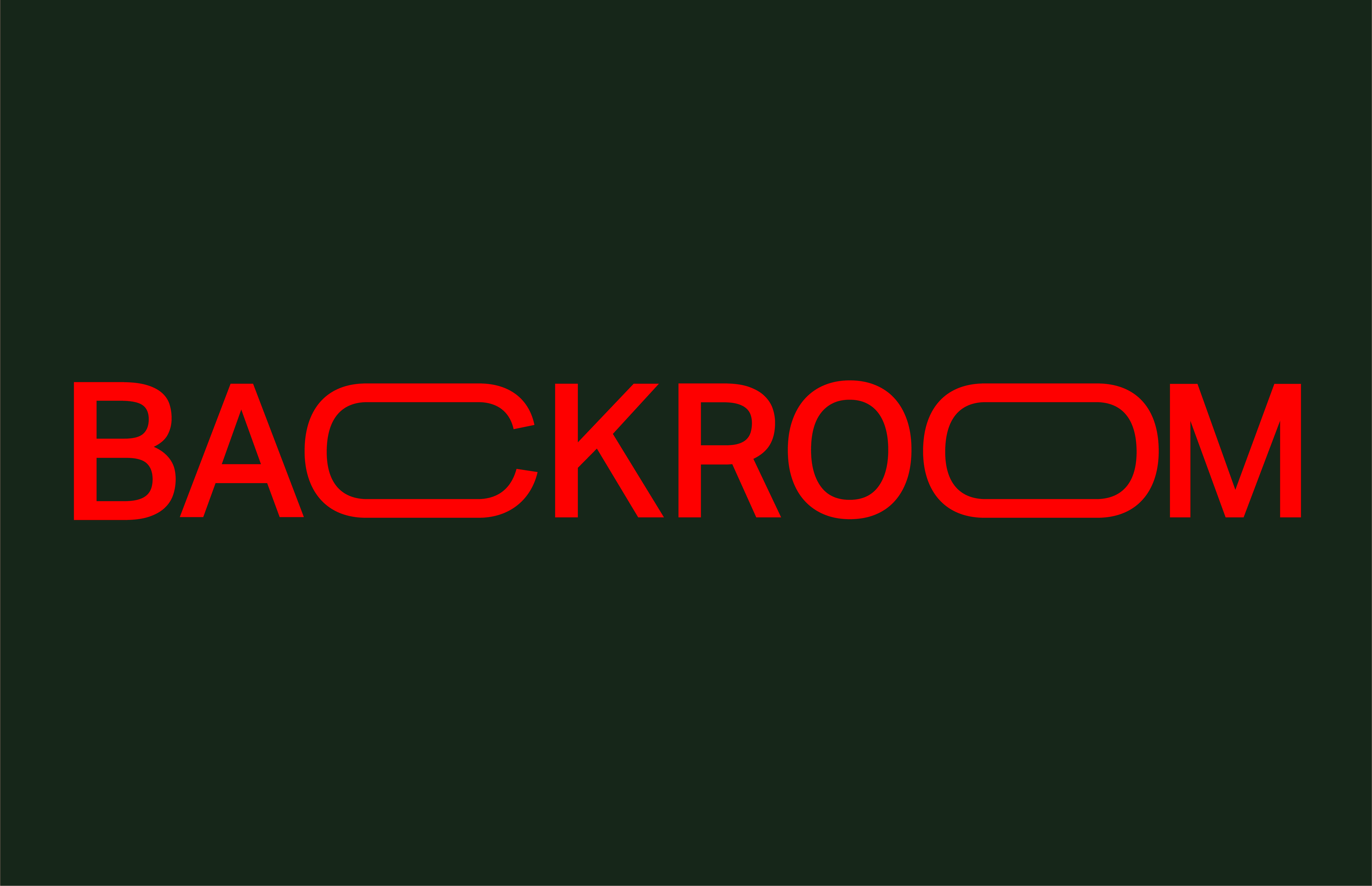
BACKROOM




NEXT STEPS
Pssst....Backroom is far from finished. I can’t wait to continue exploring its bold and demanding design. I see it turning into a digital format, potentially with AR or VR to give an immersive experience that allows you to fully immerse in the satire and humor while educating yourself. Check back in the future to see what’s happening!


